The Pantone colours of the year 2021
In a departure from tradition, this year the Pantone Institute have selected not one, but two colours of the year. The colours selected for 2021 are PANTONE 17-5104 Ultimate Gray and PANTONE 13-0647 Illuminating. Ultimate Gray is a sober yet calming shade of grey, whereas Illuminating is a gentle but cheerful yellow.
Ultimate Gray and Illuminating aren’t ‘joint winners’ exactly. Instead, it is the specific combination of these two shades that Pantone offers up together as a pairing to represent 2021. The only other occasion when Pantone picked two colours was with the combination of Rose Quartz and Serenity in 2016.
What is Pantone?
Many of us will have encountered the word ‘Pantone’ in association with colour. We may even have come across the pleasing books of colour swatches that bear the Pantone name. Designers of all persuasions will be familiar with the Pantone Matching System® that helps them to ensure colour consistency between inks, paints and materials.

Behind this system is a company called the Pantone Color Institute, owned by the Danaher Corporation and headquartered in Carlstadt, New Jersey. The company was founded in the 1950s, and the celebrated Pantone Matching System® was introduced in 1963. It’s been a standard reference among designers, printers and manufacturers ever since.
The first-ever colour of the year was Cerulean Blue, which the Institute named for 2000. Throughout the two decades since, whenever Pantone makes its announcement, the design world takes notice.
Trendsetting
And well it might, because Pantone has an uncanny knack for hitting on the spirit of the times. Often, their annual colour choice will go on to resonate with world events in the year ahead.
When Pantone announced 18-3838 Ultra Violet as 2018’s colour of the year, they proposed that it would symbolise space exploration and meditation. Sure enough, that year saw the first US astronauts take flight since 2011 and ideas around mindfulness blossom in the popular consciousness.
The rationale behind 2019’s choice of 16-1546 Living Coral was an increasing focus on environmental concerns. The ensuing 12 months saw Greta Thunberg speak at Davos and the rise of the Extinction Rebellion movement.
While the Pantone Institute is unlikely to have foreseen the events of 2020, its choice of 19-4052 Classic Blue for that year figured prominently in endless news footage — as the most popular colour for medical scrubs.
Why two?
By choosing a two colour combo as their pick for 2021, Pantone seems to be promoting ideas of collaboration, partnership and unity. It’s certainly a welcome attitude for them to adopt in such troubled times. It evokes ideas of reconciliation and healing that are sorely needed after a year of deadly disease and divisive politics.
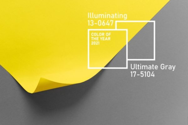
But as well as togetherness, this dual approach also highlights contrast. The two colours stand for the seriousness of our current experiences set against the brightness of our optimism. The steadfast Ultimate Gray represents determination in adversity, but that’s coupled with the upbeat yellow of Illuminating, which expresses hope for a brighter future. Leatrice Eiseman, Executive Director of The Pantone Color Institute, puts it like this:
“The unions of an enduring Ultimate Gray with the vibrant yellow Illuminating expresses a message of positivity supported by fortitude. Practical and rock-solid but at the same time warming and optimistic, this is a colour combination that gives us resilience and hope. We need to feel encouraged and uplifted; this is essential to the human spirit.”
Fade to Grey
On the face of it, grey doesn’t seem the most inspiring choice. Few people would volunteer grey as their favourite colour. Frankly, unless there are fifty shades of it, it’s just not that exciting. The name Ultimate Gray does it’s best to inject a bit of buzz, but really, it is what it is – a medium shade of grey.
Pantone likens it to “pebbles on the beach and natural elements”, and maybe there’s a suggestion of grounded, mineral calmness to the colour. The main purpose for this choice, it must be said, is as a springboard for the more charismatic Illuminating yellow – as a counterpoint that allows its partner to ping.
Mellow Yellow
Illuminating yellow veers more towards a pastel than the acid yellows or ubiquitous mustard shades we’ve seen so much of in recent years. It’s not an assertive, strident yellow. It’s mellowness instead suggests cautious optimism.
Pantone somewhat ambitiously credits Illuminating with being “imbued with solar power”. While you’d be hard put to run your garden lights off it, it’s difficult to shake the associations this colour has with new dawns, hope, the potential for rebirth and all that jazz.
Going critical
The choice of this pairing hasn’t been to everyone’s tastes, spurring a wave of criticism on social media. Cynical observers have compared the combination to anything from a car park décor to Dyson hand-dryers to double-yellow lines on a grey road to reflective grey strips over a hi-vis jacket.
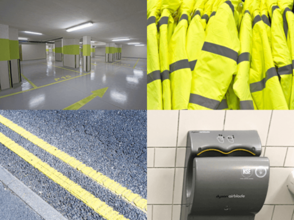
Many of these comparisons are a little unfair, though. In reality, Illuminating is a far more subdued hue than the hazard-warning yellow that’s alluded to in these criticisms!
The reality is far more low-key. The marriage of mid-grey and mellow-yellow is gender-neutral as well as politically neutral. Which is no bad thing, but it feels a little emotionally neutral too. The result could be seen as non-committal, boring and bland.
A designer’s view
This particular scheme is nothing new to Headlein Printers graphic designer Gary Hawkes:
“Yellow and grey is making its 20-year cyclical appearance. It’s subconscious but, it’s a colour combo I will always associate with the 80s and the wardrobe choices of TV-AM presenter Mike Morris! Later on, it was popular once again through my art college years, around the late nineties.”
It’s an aesthetic that comes and goes for sure, but absence makes the heart grow fonder:
“Despite being a good combination, I think its period of hiatus is justified. It does have a short shelf-life but that’s OK. Whether it’s just zeitgeist or carefully researched, the timing of its return is perfect. We are living through a grey time and we are in need of something bright and sun-coloured, are we not?”
Mix and match
Achieving Pantone colours in print through the 4-colour process can be an art in itself. Once again Gary has some tips:
“The closest matches to the Pantones for us printers and designers is Cool Gray 7c (CMYK breakdown = c42, m32, y32, k10) and for the yellow, 106c (c56, m5, y80, k10) or 113c (c4, m9, y76, k0).”
Get the filter
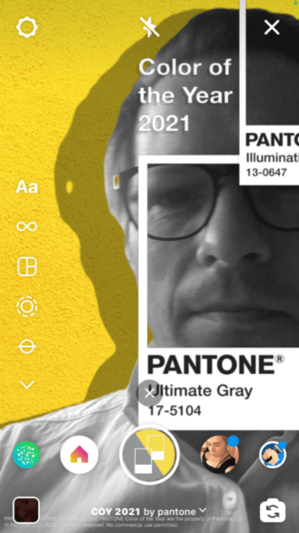
To mark 2021’s colour of the year, the Pantone Institute has accompanied their announcement with a special edition Instagram filter. Matt that the app feels highlights the best approach when you’re looking to apply this colour pairing:
“I think the most successful use of this duo is best illustrated by the Pantone Instagram filter with a greyscale photographic image on a block yellow background. Anything else just seems too retro for me.”
A mixed palette
Is it the freshest or most inspiring choice of colours we’ve ever seen? Perhaps not, but while Pantone’s choice of Ultimate Gray and Illuminating seems a little safe and slightly backwards-looking, maybe a bit of safety and comfort is what the world is craving right now.
Talk to us today about Pantone Colour printing.


